nonplace studio operates as a design studio, engaging with exhibitions, publications, websites, and visual identity systems. It treats visual structure as a perceptual interface and, through the composition of information and perception, shapes specific visual contexts and perceptual experiences.
We are a cross-disciplinary studio operating across design and artistic practice, investigating the generative mechanisms, transformation pathways, and structural shifts of visual language across diverse media. Our practice spans visual design, spatial installations, moving image, and virtual experiences.
NONPLACE functions as an art collective, working within the transitional space between the physical and the virtual. It attends to perceptual differences that emerge through media transformations and explores new narrative languages arising from these conditions.
Knowing from Afar is a companion publication to the exhibition Latent Science: Telepathy in the Shadow, marking the inaugural volume of the project HERmit Script, an non-profit publishing plan by HERmit Space. The artworks featured in the exhibition are woven into three distinct chapters. Through excerpts and divergent writings orbiting each piece, the publication attempts to delineate the intersection of pan-psychological and pan-scientific inquiries.
In the design of this book, we sought to leverage the physical properties of paper as a medium to convey the hazy, the “grey zone” of telepathy—a subject that remains scientifically unproven yet impossible to debunk. We selected translucent paper, dividing the front and back of each page into a “Bright Side” and a “Dark Side”. The “Bright Side” features info, relating imagery rendered in white ink alongside the main body of the text and images, while the “Dark Side”carries the image boundaries and layouts defined by black ink and their corresponding captions. As the reader navigates between light and shadow, the two sides permeate and coalesce through the paper fibers, summoning the subtle silhouettes and paradoxical intimacy inherent to “telepathy”.
Empty Set is a solo exhibition by Pratchaya Phinthong at Para Site in Hong Kong. The exhibition takes the “empty set” (∅)—a circle with a diagonal dash, an absence with defined boundaries yet containing no elements—as a guiding concept, loosening rigid knowledge structures. The space is opened up to establish a direct relationship with external realities, where walls, windows, and thresholds are reactivated as devices of intervention.
The visual design begins from the void left by the removed windows, extending a path of “emptiness” beyond the exhibition space. This trajectory traces an unstable boundary, suggesting fractures in both geopolitical and cognitive structures. Using Google Earth as its canvas—a constantly redrawn apparatus of power—it forms an “empty set” marked by gaps and distortions, where images, text, and territorial lines overlap and intersect.
The poster and leaflet are combined into a single A2 folded sheet. Images are printed with UV-sensitive ink, while the text appears in silver. Within the open exhibition space, the images emerge and fade with changing ultraviolet conditions. This instability echoes the shifting light and energy flows of Hong Kong’s subtropical monsoon climate. The printed matter thus becomes an interface activated by the environment—an open, variable “empty set” through which the visual is continuously reconfigured.
A research office, a hub, an assembly point, a slow archive, a reader, a pivot.
xuanguan 玄关 dwells in the interspace of entry and pause. It is a space that explores the intersections of art, science, and society through the lens of Asian technological cultures. It examines how technologies are made, lived, and culturally situated across Asia, and how these realities entangle with global discourse.
Through exhibitions, gatherings, and interdisciplinary research, xuanguan advances critical cross-cultural understanding as essential to engaging contemporary science and technology. Operating in the interstices of knowledge systems, it translates and channels ideas across contexts.
For the visual design, the logo is structured around the floor plan of two intersecting open doorways, forming an illogical spatial relationship of hallway and threshold. The two characters are placed in contrasting spatial conditions: 玄 (xuan) is enclosed within a closed form, while 关 (guan) is situated in an open, unbounded space.
The 13th Seoul Mediacity Biennale Séance: Technology of the Spirit Inspired by occult, mystical, and spiritual traditions, these alternative“technologies” contest the accelerationist and rationalistic logics of capitalist modernity, and might therefore help us to resist- and reconfigure-the political and intellectual structures that shape our experience.
The visual system composed of radiant chromatic halos. These multicolored halos unfold in gradual succession, converging into a field of energy—an open and flexible visual language that extends infinitely. They evoke the flow and convergence of spiritual forces, opening portals to parallel realities of coexistence.
The Color Manifesto—jointly authored by the curatorial, editorial, spatial, and visual design teams—was published as both statement and invitation. We established the color system as the fundamental thread and organizational structure for the 13th SMB: Séance: Technology of the Spirit. The exhibition is organized into 11 chapters, each corresponding to a distinct chromatic zone. In these thematic zones, the walls and floors are saturated in dedicated hues that bleed into one another through gradients, creating a smooth chromatic transition.
Acting as a graphic index of the exhibition's spatial and thematic sequence, the guidebook translates this chromatic logic into a set of legible visual cues. By indexing the page margins with corresponding color bars, the design enables visitors to find the corresponding exhibition zones intuitively via the fore-edge. These sequential color bars produce a spectral gradient on the book's edge, compressing the exhibition's spatial progression into a visual narrative.
Full version of of the guidebook and the Color Manifesto: https://mediacityseoul.kr/en/today
Séance: Technology of the Spirit is a 650-page bilingual English-Korean publication that includes images of the exhibition installation and adds 11 newly commissioned essays.
These texts reflect on the influence of marginalized belief systems on the development of modern and contemporary art, collectively proposing an alternative—or complement—to the prevailing formalist, social, or materialist accounts. They range from an interview with the pioneering curator Alexandra Munroe on the Japanese religious movement Oomoto to a major new essay by Johanna Hedva riffing on artificial intelligence, doom, and the meaning of freedom in a deterministic universe, proposing a supplement to, and a revision of, established art-historical narratives, forming an essential conceptual map for understanding the exhibition.
As the exhibition in a publication form, the book translates and extends the project’s visual language. An array of chromatic halos spread out across the translucent tracing paper jacket, allowing image and text to overlap and merge across layers.
The layout adopts a centered structure, with the running heads, page numbers, and footnotes aligned along the central axis, establishing a ritual order of reading. The title pages of the essays introduce a symbol system drawn from visual traditions of spiritual practice, responding to Rafael Queneditt’s work Mural Abakuá and its cultural context. Operating in parallel with the exhibition’s key visual language of color, this symbol system helps translate the exhibition’s conceptual structure into a complete and independent visual system, as the exhibition's culmination.
Available for purchase at: e-flux, The Book Society (Seoul), Idea Books
nonplace studio in collaboration with FIRST CONTACT, created a dynamic visual for ICONIC HAUS, a temporary art space co-initiated by Mercedes-Benz and Meta Media.
The iconic shield grille, a defining element that has shaped the face of Mercedes-Benz for over a century, serves as the core visual motif. Taking the Iconic Grille as its prototype, the design reinterprets this classic structure as a self-illuminated cubic matrix, transforming it from a functional component into a symbolic interface of the digital age. Retro geometry intertwines with digital light, forming an Iconic Face that transcends time.
Optical Intermediate is an exhibition that explores the intersection between perception, technology, and artistic mediation. Before entering the main exhibition space, visitors encounter an intermediate zone resembling a “surveillance room.” A distributed network of cameras captures live footage from across the gallery, collecting and transmitting images from multiple positions in real time. Within this space, these images are juxtaposed and reconfigured into a composite visual field composed of fragmented viewpoints, translating the originally continuous exhibition space into a multiplicity of unstable image-based environments.
For the exhibition’s visual identity, a segment of mirrored imagery generated during technical experimentation was selected as the motion poster. As a handheld surveillance camera is directed toward a screen, transmission delay, optical reflection and refraction, together with continuous adjustments in focal length, produce layered image structures and color variations. This process not only reveals the visual behavior of the technical system but also echoes the exhibition’s central concerns with mediation and modes of seeing.
MC2.art is a digital-first platform at the intersection of technology and the arts, founded on the potential of creative partnerships, editorial insight, and imagination in the digital age. Co-founded by ArtReview and Nowness, it takes its cue from the mass–energy equivalence equation E = MC², a transformative formula that reshaped our understanding of energy and matter. From this point of departure, MC2 draws on the equation to articulate the evolving synergy between creativity and technology.
The visual identity builds on this logic, translating the equation into an open, generative system. The three elements, M, C, and ², shift in scale, pulling and activating one another to produce a range of decentralised configurations. Here, the exponent operates as a visual mechanism and a driver of growth, pointing to the exponential potential generated through the interaction of creativity and computing, as well as the emergence of new relational structures. Extending this approach, the web design adopts a ×2 progressive grid system that echoes these dynamic scale relationships and shapes distinct layouts across different sections.
Taken as a whole, the visual system operates as an evolving framework—scalable, adaptable, and inherently collaborative—forming a visual ecology that reflects MC2’s engagement with the shifting dynamics between art, technology, and future image production.
Visual design for the exhibition How to be Happy Together? at Para Site, Hong Kong. Departing loosely from Wong Kar Wai’s Happy Together (1997), the ehibition features over twenty artists from Hong Kong, its neighbouring localities, and Latin America, the exhibition alludes to Hong Kong’s clichéd status as a para-site ‘between east and west’, and ‘between tradition and modernity’, in order to interrogate encounters both imagined and real between two seemingly distant ends of the world.
The compact black titles and dark cyan text flowing from top to bottom serve as visual metaphors for Wong Kar-Wai's 1997 film Happy Together and its iconic Iguazu Falls scene. The mirror-flipped characters create a reading experience that feels simultaneously familiar and strange.
The exhibition catalogue translates the hollow spatial structure into its layout design. The main text situated in the margin area, while the central are is reserved for additional information. Through mirrored text and inverted layouts, the design presents the interplay of dualities—front and back, inside and outside, self and other—reflecting the exhibition's examination of dualism and its critical discourse.
The exhibition invites viewers to freely navigate between two spaces, each representing the perspectives of Earth and extraterrestrial civilizations. Based on the spatial arrangement of the exhibition, we drew a map and etched it onto a metal plate. The plate then becomes the centerpiece of the exhibition’s visual design.
Just like the fuzzy sketches drawn by explorers or conquerors at the dawn of the Age of Discovery, where artists filled the uncharted regions with sea monsters, mermaids, and other mythical or fictional creatures. Rather than pursuing accuracy, the map reimagines how extraterrestrial civilizations might perceive space, as envisioned in The Three-Body Problem. Through this physical map, we attempt to capture both the tangible and intangible fields of the space, evoking the turbulence and resonance that might arise from the first contact between civilizations.
Poster design for MC2's pre-launch screening "Weaving the Unseen: AI and Visual Narratives", jointly presented by the art and technology platform MC2 and the MetaEye Festival. The event explores the complex relationship between artificial intelligence and visual narratives through a series of screenings and discussions.
In her autobiography, computer vision expert Fei-Fei Li posits that the emergence of biological vision triggered the Cambrian explosion beneath the ancient ocean waves 500 million years ago, catalyzing the birth and evolution of numerous species. The landmark event in this explosion was the appearance of the first eye in the biological world—the trilobite's eye. With this first glimpse of the world through the trilobite's eye, the vision became the foundation for all civilizations. Could the rise of machine vision spark a similar wave of digital evolution?
We aimed to address this critical theme through our visual design. The poster features two eyes as its central visual elements: one facing the screen, the other facing away. Video clips from the screening are projected and circulated within the eyes, generating an ever-changing image. These two eyes symbolize the challenge to the subjectivity of observer and observed, of humans and machines. They also represent the narrator and spectator of visual narratives, the looking back to the history and the peering into the future. It embodies our focus on technology and technology's reciprocal gaze upon humanity.
A video version of this dynamic poster also serves as a transition video during the intermission of the screening.
The Larva of Time is an interdisciplinary exhibition, invited two artists and two scientists to investigate unnoticed temporal imprints in the processes of artistic and scientific research.
In the visual design of the exhibition, we use eye tracking technology to capture the gaze trajectory, using our eyes to depict an imaginary butterfly. The design process is more of an experiment or creation, weaving the visual image of the exhibition into the overall narrative of observation and metamorphosis, time and trace, science and art.
Exhibition and visual design for SCRY POP-UP SHANGHAI 2024.
SCRY is a pioneering footwear laboratory. We metaphorically presented SCRY’s integrated additive manufacturing technology and its rapid design and manufacturing iteration capability in the form of spacial installation, giving birth to SCRY Print Lab, a “liminal space” that integrates avant-garde aesthetics with daily space.
The scanner on the top of the printer installation automatically scans at a certain frequency, continuously capturing and recording the time and space in flux as image data. The moving light belt of the scanner provides a changing light effect, cast through the blinds, together with the rhythm of machines’ operating echoing in the space, creating a subtle yet rich audio-visual experience.
All the visual materials come from the printer installation in the space.
The theme of the 14th Shanghai Biennale consists of two words: “Cosmos” and “Cinema”. In the visual system, the core elements are composed of a rotating black cube; a light screen projected on the black cube; and a series of text information that follows the movement of the cube and light screen. The three elements respectively metaphorize the cosmos, the cinema, and the information and civilization within. The three create an ever-changing superimposed connection reflecting the process of continuous exploration, contemplations, interpretations, and representation of us human beings of the cosmos.
Published as part of the 14th Shanghai Biennale, the Cosmos Cinema Reader presents a series of articles on the theme of “Cosmos Cinema.” We selected a relatively smaller format with a wider typeface to make the reading experience more akin to a novel than an academic essay collection. The publication is bilingual, with the Chinese and English pages starting from opposite side of the book. This rotated reading direction evokes a sense of weightlessness.
Extending the exhibition’s visual language of the “rotating black cube” and the “light screen,” the pocket format with blackened edges, presents the book as a black cube, with a white light screen projected on its spine, casting onto the front and back covers. The gray background of the inner pages turns the book into a dark mode, allowing the white text to create an interplay of light and shadow, reminiscent of flickering stars in the cosmos.
Available for purchase at: dododo book
As the catalogue for the 14th Shanghai Biennale, this book recreates the exhibition’s viewing experience through its content and visual layout. The exhibition uses the linear narrative and montage techniques from film in both curation and spatial arrangement –– the viewing process follows a predetermined, irreversible linear path, during which there are embedded “montage flashback” moments, where the audience, moving through the space, re-encounters works from new perspectives at different spatial moments.
We incorporated this narrative into the catalogue's design, collaborating with the photographer to capture each work by the 75 participating artists along the exhibition’s viewing path from a first-person perspective, from the start to the end. These images align along a central axis throughout the pages. The interspersed silver image pages present the “montage flashback” moments experienced during the viewing journey (for example, when an audience reaches the second-floor corridor, they re-encounter works from the first floor from a bird's-eye view). The information text moves along with each image of work, restoring the experience of reading labels while viewing the exhibition.
In addition to the exhibition, text content related to the theme of Cosmos Cinema is presented at the end of the book on silver pages, like the end credits of a movie. In these ways, we present an immersive documentary of the Cosmos Cinema exhibition through this catalogue.
Available for purchase at: Sternberg Press, dododo book
Digital Design: AIGC Builders & Creators Conference is conceived as a platform for exchange between builders and creators. Creation, connection, and action form the core dynamic of the event—through which AIGC practitioners actively shape the evolving landscape of technology and industry.
The visual system is anchored in three fundamental geometric forms—square, circle, and triangle. From these elements, connective paths extend and assemble into the typographic structure of “AIGC.” These paths remain open rather than closed, continuously branching into new connections. This openness reflects the expanding network of creators, as well as the fluid, multi-directional growth of both the industry and the conference itself.
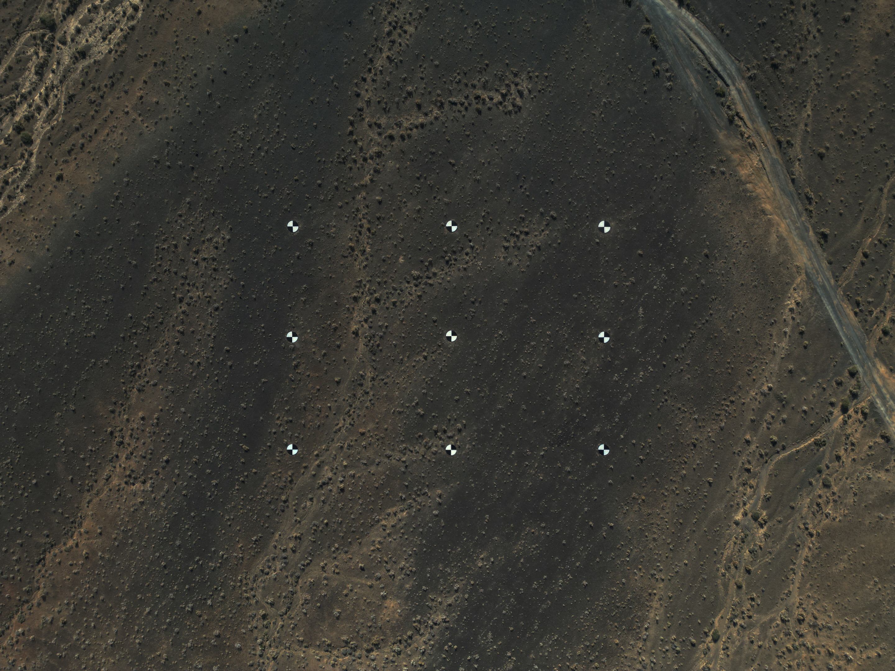
We marked nine integer latitude–longitude intersections in the Gobi Desert within the Karamay region of Xinjiang Province, China, corresponding to the nine vertices of one-arc-second grid squares.
The Earth is treated as a computable model: coordinates unified within a single reference frame, data collected across different moments aligned and merged into a continuous surface. In Google Earth, the terrain appears as a coarse texture. Sparse vegetation collapses into unstable pixels, while images captured at different times are stitched together with their seams still faintly visible. The Gobi offers no distinct landmarks, and no location here carries a name on any map. Coordinates hover above the ambiguous image as abstract numerical references.
Using handheld GPS devices, we searched across the Gobi for these points, repeatedly measuring and calculating the actual distances represented by each arc second. Although the signal from the GNSS receiver drifted continuously, we attempted to stabilize the coordinates as fixed positions on a surface lacking any reliable points of reference. Nine discarded saw blades, each 2.5 meters in diameter, were transported from a nearby quarry by forklift and placed at the designated coordinates. Their surfaces were painted in alternating black-and-white sections to indicate the directions of latitude and longitude, and to remain legible within satellite imagery at a resolution of 1–2 meters.
These markers extend toward a future image update. We anticipate that when new satellite imagery replaces the current data, the markers may reappear and align with our intended positions. Yet reality may diverge from the coordinate grid by tens of centimeters or even several meters, a discrepancy accumulated throughout the entire process: mathematical modeling, satellite imaging, signal drift, and field operations. Strong winds may shift the blades, rain may erode the painted patterns, the metal will gradually corrode, or the area may simply never be captured again.
*This residency project was supported by art platform 149.